
Embroidery, a timeless art, demands meticulous effort. Every stitch craves the ideal thread hue, turning a mere project into a masterpiece. But you may not know that thread color choice is the fine line that can turn a masterpiece into a meh-sterpiece.
Therefore, if you’re beginning to embroider or just looking to improve your thread color-picking skills, this guide is for you. This guide will give you an insight into choosing embroidery thread color options with the best tools and apps.
Not to mention a few tips for inspiration and some tricks to create the perfect harmony, contrast, and variety in the embroidery design. We’ll also share how to navigate the difficulties you may face when choosing the thread colors. So, without further ado, let’s begin!
The Color Wheel and Color Schemes: Vibrant Possibilities
We’ll start with the best tool to pick thread colors for your custom embroidery patches in Houston project. Here’s a brief overview of the color wheel, how it can help you choose thread colors, and what are the schemes and effects it can create:
How the Color Wheel Can Help You Choose Thread Colors
The color wheel is a visual guide with color hues arranged in a circle, depicting relationships between primary, secondary, and tertiary colors. It looks like a circular rainbow with red, yellow, and blue as the primary colors, and if you mix them, you get secondary colors (orange, green, and purple).
When you mix primary and secondary colors, you get tertiary colors. Thus, the wheel gives you a vibrant spectrum of possibilities, helping you choose thread colors in embroidery for harmonious combinations. You can use the color wheel to select colors that complement each other and work well together in your embroidery projects.
Different Types of Color Schemes and How to Use Them
Pick colors on the color wheel to make specific visual effects in your combos. The color wheel helps you create schemes by looking at how colors relate. Check out these common schemes:
1. Monochromatic Scheme
Stick to one color but mix up the shades – that’s the monochromatic scheme. Use different tones of the same color, and since they’re all in the same color wheel neighborhood, they blend seamlessly.
2. Complementary Scheme
This scheme combines colors from opposite sides of the color wheel. The stark difference makes for a vibrant embroidery. You can use this scheme sparingly for focal points and accents.
3. Analogous Scheme
Analogous colors are neighbors on the color wheel. You can create a harmonious and cohesive effect on the fabric using these embroidery colors.
4. Triadic Scheme
The Triadic color scheme links three different colors on the wheel, evenly spaced, to shape a triangle. This scheme is great for injecting liveliness and vigor into your design.
5. Tetradic Scheme
A tetradic color scheme involves using four colors together, usually in two pairs of complementary colors. This scheme gives a high contrast and energetic vibe.
6. Split-Tetradic Scheme
In split tetradic, you pick a pair of opposite colors from the tetradic scheme and swap one of them with its neighboring hues. This gives a gentler and subtler contrast.
Examples of Color Schemes and Their Effects on Embroidery
Here are some examples of how to choose embroidery thread color to make color schemes, creating different effects in embroidery:
- Monochromatic Color Scheme Effect – Use the monochromatic scheme to embroider a night sky in various shades of blue. Or make a rose, its petals unfurling in hues ranging from rich burgundy to gentle blush.
- Complementary Color Scheme Effect – You can use red and green to create a Christmas-themed embroidery or purple and yellow to embroider pansies on a light purple fabric.
- Analogous Color Scheme Effect – If your fabric is green, picking thread colors like yellow-green or blue-green will give a nice, cohesive vibe. Or think of colors like orange, pink, and purple. You can create a sunset embroidery with these colors, where orange harmoniously blends into pink and then purple.
- Triadic Color Scheme Effect – You can use red, blue, and yellow colors to create a bright floral design or cross-stitch patterns. Or design a peacock with green and sapphire feathers and flashes of gold.
- Tetradic Color Scheme Effect – Use this scheme to embroider a playful underwater scene featuring vibrant fish in turquoise, orange, purple, and lime green. Or you can create a sunflower with a red center, yellow petals, green leaves, and hints of blue in the background.
- Split-Tetradic Color Scheme Effect – Play around with geometric shapes filled with split tetradic shades for a visually intriguing effect. Or craft a serene forest using earthy greens, hints of yellow-green and blue-green, and add lively touches of orange for mushrooms or berries.
Tips and Tricks for Choosing Thread Colors: Get the Perfect Pallete
Still confused after learning how to choose thread colors for embroidery for beginners with a color wheel? Check out some tips and tricks to get the perfect palette for your embroidery project:
Sources of Inspiration for Thread Colors
Here are some sources you can take inspiration from when choosing thread colors for your embroidery project:
- Fabric – Let the fabric be your guide. Explore subtle variations in shade and pattern, considering highlights, shadows, and unexpected pops of color. For instance, match your thread to the dominant color of the fabric or choose a complementary color to create a contrast.
- Design – While following a pattern’s suggested thread colors can provide direction, don’t shy away from infusing your personality. Experiment with different hues and shades to make the project distinctly yours.
- Nature – Nature is a treasure trove of color inspiration. Whether it’s the vibrant greens of spring or the rich earth tones of autumn, take cues from the world around you for captivating thread combinations.
- Personal Flair – Trust your instincts and consider your preferences. Choose thread colors you love and find visually appealing, as your unique aesthetic sense will add a personal touch to your project.
- Color Harmony – Explore color theory basics for guidance. Whether opting for complementary, analogous, or monochromatic schemes, use the color wheel to harmonize your thread choices with your overall design.
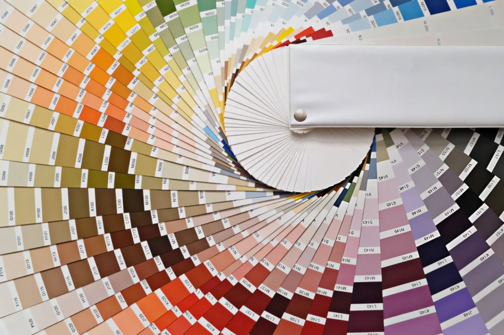
Tools and Resources for Previewing and Matching Thread Colors
Check out the online tools, apps, and resources below that can help you preview and match thread colors:
- Thread Colors Chart – Get a visual guide with a thread color chart with names and embroidery thread color codes, aiding in color selection for your project.
- Online Tools – Utilize resources like the DMC embroidery thread color chart and Thread Palette Generator for convenient online color matching.
- Apps – Simplify color choices with apps like ColorSnap by Sherwin-Williams or ColorSmart by Behr, offering on-the-go thread color preview options.
How to Balance Contrast, Harmony, and Variety in Thread Colors
For a show-stopping design, consider these tips on balancing contrast, harmony, and variety in thread colors:
- Contrast – Make details pop with contrasting thread colors. Suppose you want to know the embroidery thread color for a t-shirt with a light background. Simply use black thread color to embroider a bold and eye-catching effect.
- Harmony – Achieve unity with similar undertones or colors from the same family. This imparts a calming and sophisticated look. Choose neighboring or opposite hues on the color wheel for cohesion.
- Variety – Add a dash of diversity while maintaining harmony. Introduce an unexpected color or subtle shade variations for interest, like using different shades or complementary colors.
Common Pitfalls and Challenges When Choosing Thread Colors
When picking thread colors, be mindful of common issues such as the following:
1. Lighting
Issue – Lighting affects the appearance of thread colors.
Solution – View the threads under various lighting conditions. Check them in natural daylight whenever you can, or if that’s not an option, use a daylight-balanced bulb or light source.
2. Fading and Bleeding
Issue – Poor-quality dyes or inexpensive materials can cause bleeding or fading, especially when exposed to water, sunlight, or friction.
Solution – Choose threads labeled “colorfast” or “lightfast” and go for well-known brands with a reputation for quality dyes and materials. Also, conduct a small test by exposing them to water and a gentle detergent before using them in your project.
3. Fabric Texture
Issue – Thread colors may look different on different fabric textures.
Solution – Try out thread colors on a fabric scrap before deciding. Think about how the thread’s shine or texture will work with the fabric’s surface.
Final Words
Embroidery’s true magic lies in the artful choice of thread colors. Therefore, learning to choose embroidery thread color floss is your key to crafting a masterpiece. Add a personal twist, take inspiration from fabric and nature, and create color harmony.
Don’t forget to check out online charts for thread colors and apps, and watch out for issues like light, fading, and bleeding. Test wisely, choose quality threads, and turn your embroidery from basic to brilliant with the ideal palette!
FAQs
How can I match my thread colors to the fabric I’m using?
You can match your thread colors to your fabric by checking the fabric tones and patterns. Note highlights, shadows, and unexpected pops of color in it for thread inspiration.
How many colors should I use in an embroidery design?
Using 3-5 colors is ideal for an embroidery design. This is for balance. But it also depends on your design. Go simpler with fewer colors, or use more for intricate designs.
How can I coordinate thread colors for a multi-colored embroidery design?
Opt for a dominant color such as royal blue. Then, balance it with complementary hues like soft gold and burgundy to coordinate thread colors for a multi-colored embroidery design.
Are there any guidelines for choosing thread colors for specific types of fabric?
No, there aren’t any general guidelines for choosing thread colors based on fabric. However, bright shades like coral and turquoise suit light fabrics, e.g., chiffon, cotton, linen, etc. While subtle tones such as forest green and deep burgundy complement darker materials e.g., velvet, wool, etc.
What are some tips for choosing thread colors for embroidery on dark-colored fabrics?
Choose bold, contrasting colors for visibility on dark-colored fabric. You can experiment with metallic threads for added vibrancy.
What is the role of contrast in choosing thread colors for embroidery?
You can enhance visual interest with contrast. Use light threads on dark fabric or vice versa to highlight design elements. For instance, applying a deep purple velvet cushion with white thread or white flowers on a purple cushion offers a luxe and elegant contrast.